H.
Project Overview:
The Product:
An art gallery website for visitors to easily preview and book exhibitions.
Project Duration:
10 weeks.


The Problem:
Sometimes the amount of visitors of an art exhibitions on certain day is too many to have a good experience for a viewer, and visitors cannot find out which day is the best time for them to have a visit. Other than that, it’s also inconvenient to gain the information of an exhibition or an artwork when they are visiting, since the text of it on the exhibition is small.
My role:
I planned this project for portfolio showcase, and I conducted every step of this project by myself, from user research to prototype.
The Goal:
Showcase the amount of visitors booked on certain day on a booking calendar to let visitors having knowledge about if certain day is crowded or not. Besides, there would also be some exhibition and artwork information on exhibition page.
Responsibilities:
•User research.
•Define problems and ideate solutions.
•Wireframes and prototype.
•Visual design
Understanding the Users:
User Research:
I conducted user research by interviewing 3 frequent gallery visitors, and my goal was to understand the inconvenience they met often when they are visiting gallery exhibitions.
Pain Points:
-
There are too many people visiting exhibitions on certain day.
-
Sometimes it’s inconvenient to read the background information of an artwork or an exhibition due to the crowdedness.
-
Sometimes it’s difficult to find the location of certain exhibition.
-
After leaving the exhibition, you may want to review certain exhibition information.
Persona:

User Story:
As a graphic designer who is interested in contemporary art, I want to choose the best time to visit an exhibition and get the information of an exhibition and its artworks easily, so that I can optimize the experience of visiting exhibition
User Journey map:

Problem Statement:
Catherine is a graphic designer who needs a website to choose the best time for her to visit an exhibitions and get the exhibitions and artworks information quickly and easily, because sometimes the exhibitions is crowded. It’s also hard to locate an exhibition and get the background information of an artwork.
Ideate Solutions:
Goal Statement:
Our art museum website will let users book a day for visiting with visualized amount of visitors each day and check the exhibition and artworks information on out website, which will affect how art museum visitors experience an exhibition by allowing them to visit on the day that may have less visitors and to find out the location of an exhibition as well as the background knowledge of an artwork easily. We will measure effectiveness by randomly interviewing visitors to see how many of them is currently using these functions.
Competitive Audit:


Solutions:
1.Show the amount of visitors on booking calendar.
2.Exhibition locating function on exhibition page.
3.List all of the artworks and their information on the exhibition page.
4.Folded exhibition preview on each exhibition card.
5.Balanving between text and images for readibility.
6.Minalism while also keep a constrasting visual design for visual interest and suitable branding.
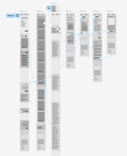
Wireframes:
Sitemap:

I created the sitemap of the whole gallery website, which contains other pages other than the main user flow.
Paper Wireframes:

I created the paper wireframes first for initial layout study, as well as the variation format on tablet and phone screen size.
Digital Wireframes:
I transfered the paper wireframes into digital version for readability and preliminary design.
Then I designed the layout of the same page on different screen sizes.
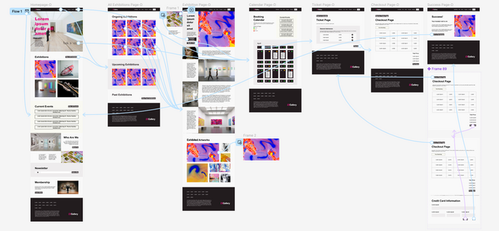
Homepage:
This page is mainly about showcasing the featured exhibitions and recent events, as well as some background information of the gallery itself, membership and newsletter subscription.
Featured exhibitions cards with an emphasize on photography for providing a sense of immersiveness of exhibitions.

Card slider in place of the grid layout for the exhibition cards on smaller screens.

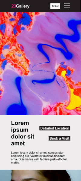
Exhibition Page:
In exhibition page, you can scrutinize the exhibition information easily like reading an article. There are also most of the artworks of an exhibition listed in a grid format at the end. There are also an exhibition location finder function as a popup page triggered by a button on the top of this page.
Exhibition locating function for visitors to easily find where the exhibition is when they are visiting. After clicking, a popup page with some location information would appear.
Asymmetrical layout design of exhibition information and photography for balancing between text and image to increase readability.


Larger font size for exhibition information on phone screen for better readability in case the viewer is viewing this page while visiting.
Calendar Page:
You can select the date you prefered to book in calendar page. The amount of people will be represented by a mark within each date cell. There is also an event reminder section at the top right. Each event will also be contained within the date cell of the date of that event.

A mark representing the amount of visitors within each date cell.
A small container with event title within the date cell
Low-Fidelity Prototype:
Events reminder


Clickable Prototype Links:
Mockups:


I design the interface in a minimalism and contrasting style to reflect the identity of this gallery as contemporary art focused. I tried to decrease the usage of color and create contrast mainly through typography and layout to draw viewers's attention onto the overall flatness as well as the balancing between text and image, hence produce a visual effect that maintains both readability and visual interest.

When you hover over the exhibition card, a left and right arrow would appear which could let you preview other exhibition pages, as well as the title of the exhibition with an up arrow beyond.

When you click the up arrow, a page with the summary of the exhibition would slide in, and you can close it with a down arrow beyond.
After clicking “detailed location”button, an exhibiton map with description would pop up.

Larger text on exhibition page for the phone screen format.


After clicking the image of an artwork, a popup page with artwork description would appear
High Fidelity Prototype:

Clickable Prototype Links:

Takeaways:
Through this project, I gained a deeper understanding of how design thinking can help to solve user problems and improve user experience.
I experimented a lot of different layout possibilities to create visual contrasts. Nevertheless, I also played around with the use of animation on assets to enhance user experience. I also learnt that by hiding certain elements as popup pages, it could reduce distraction from the main content and improve readability.
For further design, I would add a video about this gallery within the hero section of the homepage to create a more immersive effect. I would also add more complex animation on the exhibition and artwork cards to add more visual interest and interactivity.